


General Motors launched a new logo recently, part of a rebrand intended to shift focus and prepare for the automaker's onslaught of electric vehicles. The automaker wants you to think it is more inclusive than before by dropping the stodgy GM underline like a repeat of the "not your father's Oldsmobile" campaign. It might not seem like a big deal, but for General Motors, it really is. Not just because a monolith of a company is reluctant to change, but because in 113 years of operation, this would be just the fifth time the logo has changed. Even Ford, whose logo feels like it's been the same since day one, has had more changes than that.
The last major overhaul of the General Motors marque was way back in 1964, making the logo itself older than the average Canadian car buyer. So here's a look back at the shape of GM since 1908.
In the first years, the logo wasn't all that important. While the company was quickly buying up automakers, General Motors itself was just a holding company. While many companies at the time had a fancy script or logo for their stock certificates, GM did not.

This badge, in a photo from 1921, is more of just an identifier than a logo. It tells you who made the car, but it hasn't really made the transition to brand icon just yet.

That would come in 1938, with the first real logo from General Motors. If it looks familiar, then it should. GM has always been a big, conservative company, and the logo reflects that it's surely no accident. Simple, straightforward, and arguably even the latest logo isn't a significant change from the logo that arrived on the cusp of the Second World War.

Next up is a logo that arrived for 1964, which is one of the most iconic emblems of all time. GM with an underline and a blue background. You'd see this one in all sorts of places on cars and trucks with any of GM's brands, including in subtle small spots like the seat belt release buttons. If you live anywhere near downtown Detroit, or most of Windsor, Ont., you've seen it for decades atop the Renaissance Center, GM's home in the motor city where it was on display at the top of one of the towers.
The next change was even more subtle, happening in 2001. GM added a splash of 3D and a more intense blue. The frame around the logo was now a proper frame and less abstract.
![]()
Following a short-lived 2005 attempt to put a silver GM badge they called the Mark of Excellence on vehicle fenders, the badge was softened and simplified in 2010. The shading of the background was different, moving from light in the centre to dark in the sides instead of top to bottom. The letters got a solid black outline, making them more dynamic.

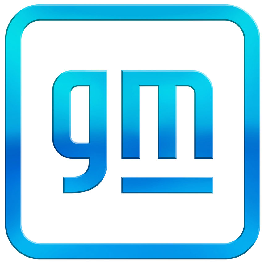
For the new look, it's lower case, even though the company insists it's a big deal for all of its employees. GM said that designers worked to "balance the history and trust inherent to the existing design with GM’s vision for the future."
The gradient of blue is supposed to evoke "the clean skies of a zero-emissions future" with the rounded edges and lowercase to "create a more modern, inclusive feel." The m underline is supposed to connect to the old logo and represent the ultium platform. The m itself, to remind you of a plug, though once we saw the elephant in the logo, it was hard to unsee it. In general, the logo has the vibe that it could have come from a social media app.
Any branding change is a big deal for a company, and changing one that's been essentially unchanged since the 1960s is no small feat. But like it or not, get used to the new GM, or is that gm, as they embrace electrification with the slogan "Everybody In."
